Matplotlib 3.6.0 (2022年9月15日) 新特性#
有关自上次修订以来的所有问题和拉取请求列表,请参阅 3.10.3 (2025年5月8日) 的 GitHub 统计数据。
图(Figure)和坐标系(Axes)的创建/管理#
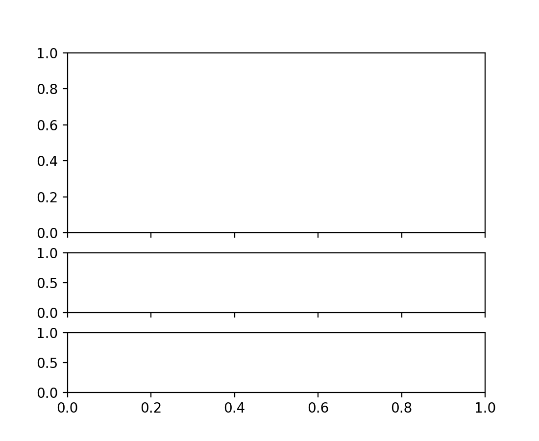
subplots, subplot_mosaic 接受 height_ratios 和 width_ratios 参数#
subplots 和 subplot_mosaic 中列和行的相对宽度和高度可以通过向方法传递 height_ratios 和 width_ratios 关键字参数来控制
fig = plt.figure()
axs = fig.subplots(3, 1, sharex=True, height_ratios=[3, 1, 1])
此前,这需要在 gridspec_kw 参数中传递这些比例
fig = plt.figure()
axs = fig.subplots(3, 1, sharex=True,
                   gridspec_kw=dict(height_ratios=[3, 1, 1]))
约束布局不再是实验性功能#
约束布局引擎和 API 不再被视为实验性功能。未经弃用期,不再允许对其行为和 API 进行任意更改。
新的 layout_engine 模块#
Matplotlib 附带 tight_layout 和 constrained_layout 布局引擎。现在提供了一个新的 layout_engine 模块,允许下游库编写自己的布局引擎,并且 Figure 对象现在可以将 LayoutEngine 子类作为 layout 参数的实参。
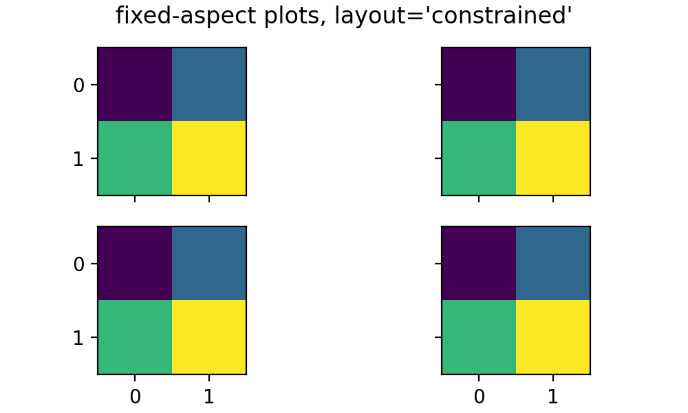
固定宽高比坐标系的压缩布局#
具有固定宽高比的坐标系现在可以使用 fig, axs = plt.subplots(2, 3, layout='compressed') 紧密排列。
使用 layout='tight' 或 'constrained' 时,具有固定宽高比的坐标系之间可能会留下很大的空白
使用 layout='compressed' 布局可以减少坐标系之间的空间,并将额外空间添加到外部边距
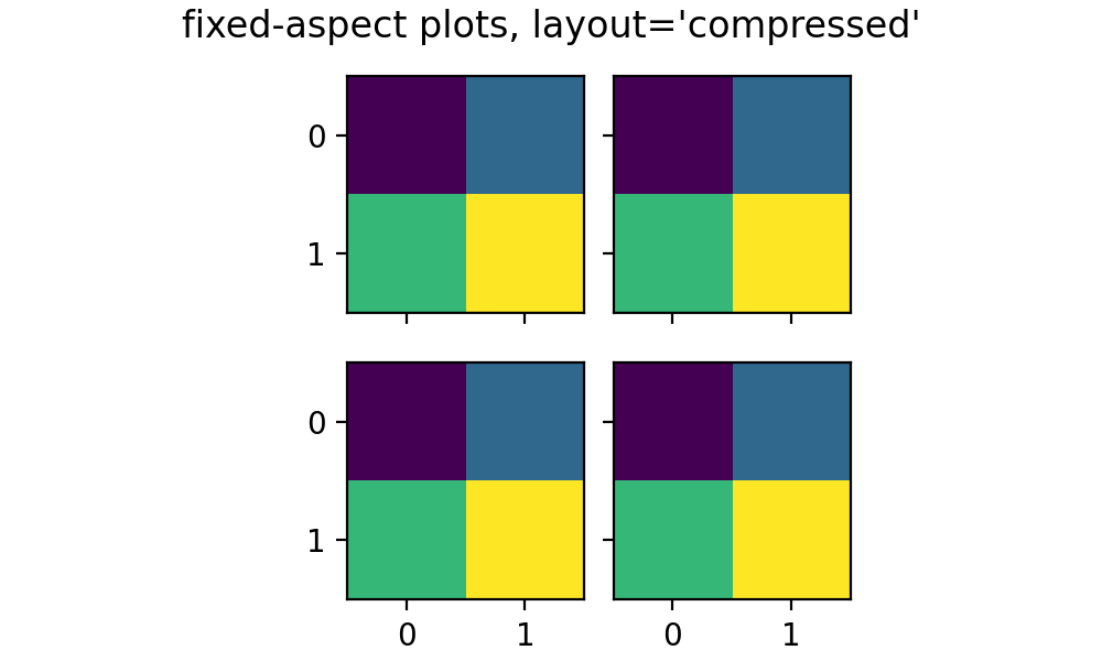
有关更多详细信息,请参阅 固定宽高比坐标系网格:“压缩”布局。
布局引擎现在可以被移除#
现在可以通过调用 Figure.set_layout_engine 并传入 'none' 来移除 Figure 上的布局引擎。这在计算布局后可能很有用,以减少计算量,例如,用于后续动画循环。
之后可以设置不同的布局引擎,只要它与先前的布局引擎兼容。
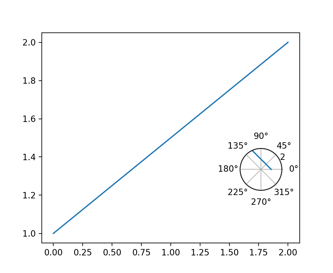
Axes.inset_axes 的灵活性#
matplotlib.axes.Axes.inset_axes 现在接受 projection、polar 和 axes_class 关键字参数,因此可以返回 matplotlib.axes.Axes 的子类。
fig, ax = plt.subplots()

ax.plot([0, 2], [1, 2])

polar_ax = ax.inset_axes([0.75, 0.25, 0.2, 0.2], projection='polar')
polar_ax.plot([0, 2], [1, 2])
WebP 现在是受支持的输出格式#
现在可以通过使用 .webp 文件扩展名,或将 format='webp' 传递给 savefig,来将图表保存为 WebP 格式。这依赖于 Pillow 对 WebP 的支持。
图表关闭时不再运行垃圾回收#
Matplotlib 存在大量循环引用(在 Figure 和 Manager 之间,Axes 和 Figure 之间,Axes 和 Artist 之间,Figure 和 Canvas 之间等),因此当用户放弃对 Figure 的最后一个引用(并从 pyplot 的状态中清除它)时,这些对象不会立即被删除。
为了解决这个问题,我们长期以来(自2004年之前)在关闭代码中都包含了一个 gc.collect(仅最低两代)以便及时清理。然而,这既没有达到我们想要的效果(因为我们的大部分对象实际上会存活下来),又由于清除了第一代而导致了无限的内存使用。
在创建和销毁图表之间存在非常紧密的循环的情况下(例如 plt.figure(); plt.close()),第一代永远不会增长到足够大,以至于 Python 考虑对更高代运行垃圾回收。这将导致无限的内存使用,因为长期存在的对象永远不会被重新考虑以查找引用循环,因此也永远不会被删除。
现在,当图表关闭时,我们不再进行任何垃圾回收,而是依赖 Python 自动决定定期运行垃圾回收。如果您有严格的内存要求,可以自行调用 gc.collect,但这可能会在紧密的计算循环中对性能产生影响。
绘图方法#
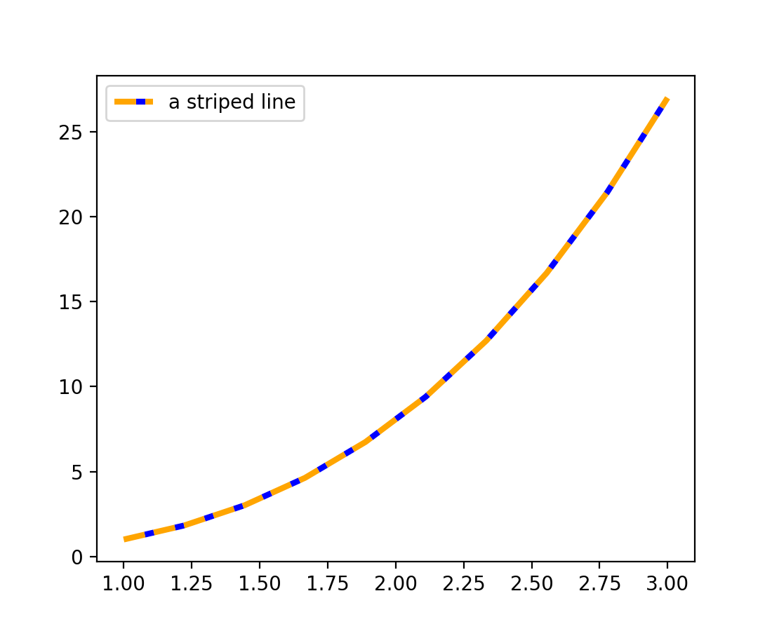
条纹线(实验性)#
plot 的新参数 gapcolor 可以创建条纹线。
x = np.linspace(1., 3., 10)
y = x**3

fig, ax = plt.subplots()
ax.plot(x, y, linestyle='--', color='orange', gapcolor='blue',
        linewidth=3, label='a striped line')
ax.legend()
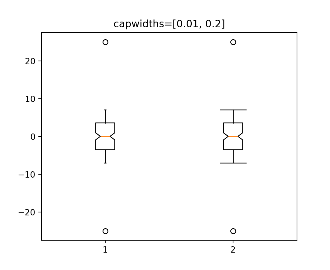
bxp 和 boxplot 中箱线图和须状图的自定义帽宽#
bxp 和 boxplot 的新参数 capwidths 允许控制箱线图和须状图中帽的宽度。
x = np.linspace(-7, 7, 140)
x = np.hstack([-25, x, 25])
capwidths = [0.01, 0.2]

fig, ax = plt.subplots()
ax.boxplot([x, x], notch=True, capwidths=capwidths)
ax.set_title(f'{capwidths=}')
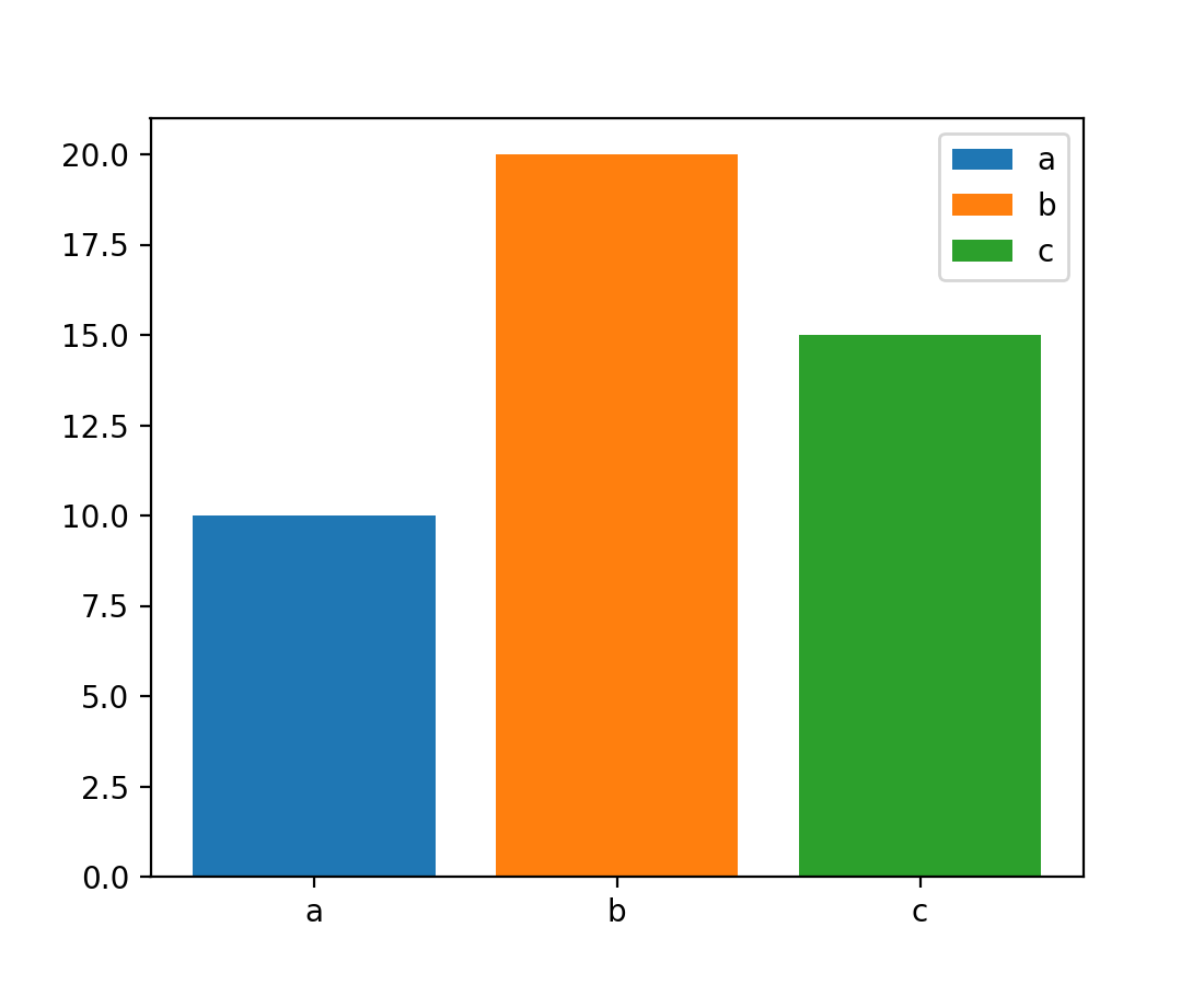
条形图中条形的更轻松标注#
bar 和 barh 的 label 参数现在可以传递一个条形标签列表。该列表的长度必须与 x 相同,并标注各个条形。重复的标签不会去重,并将导致重复的标签条目,因此最好在条形样式也不同时使用(例如,通过向 color 传递列表,如下所示)。
x = ["a", "b", "c"]
y = [10, 20, 15]
color = ['C0', 'C1', 'C2']

fig, ax = plt.subplots()
ax.bar(x, y, color=color, label=x)
ax.legend()
颜色条刻度的新样式格式字符串#
colorbar(以及其他颜色条方法)的 format 参数现在接受 {} 样式的格式字符串。
fig, ax = plt.subplots()
im = ax.imshow(z)
fig.colorbar(im, format='{x:.2e}')  # Instead of '%.2e'
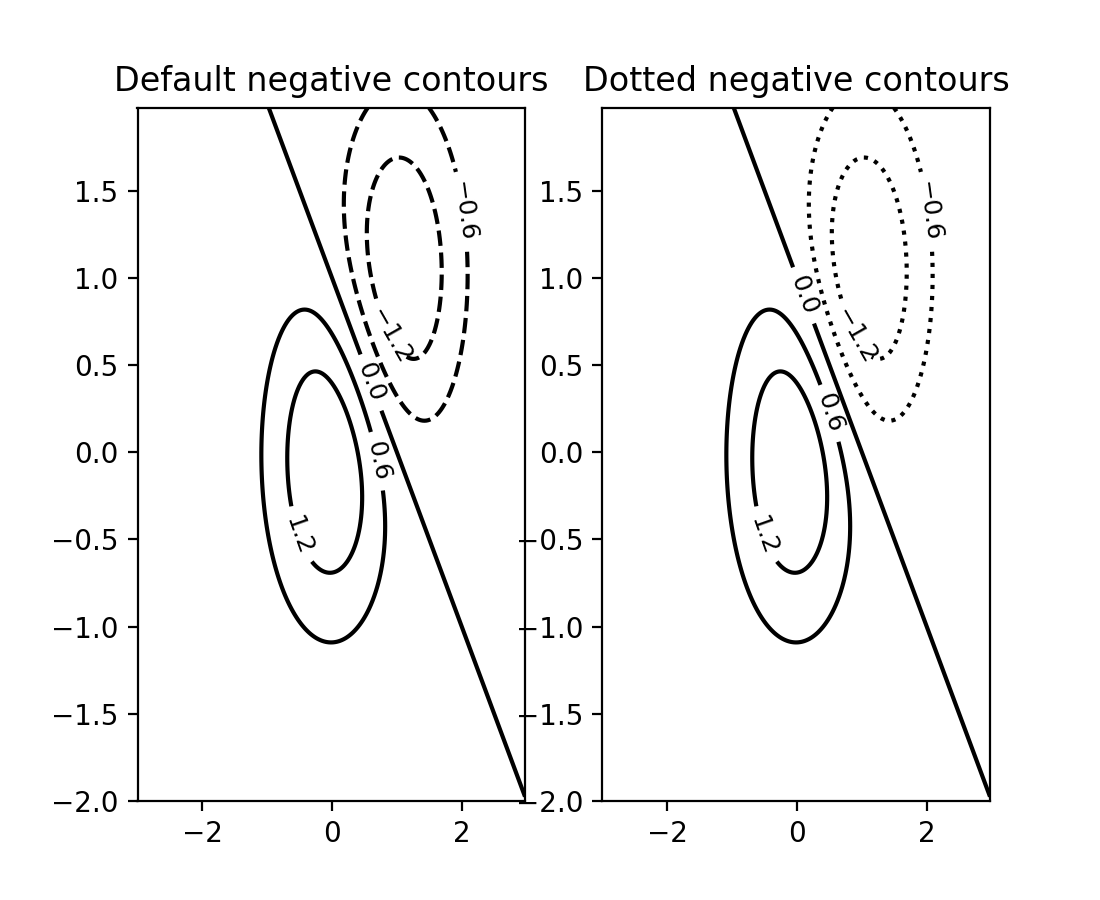
负等高线的线型可以单独设置#
可以通过将 negative_linestyles 参数传递给 Axes.contour 来设置负等高线的线型。此前,此样式只能通过 rcParams["contour.negative_linestyle"](默认值:'dashed')全局设置。
delta = 0.025
x = np.arange(-3.0, 3.0, delta)
y = np.arange(-2.0, 2.0, delta)
X, Y = np.meshgrid(x, y)
Z1 = np.exp(-X**2 - Y**2)
Z2 = np.exp(-(X - 1)**2 - (Y - 1)**2)
Z = (Z1 - Z2) * 2

fig, axs = plt.subplots(1, 2)

CS = axs[0].contour(X, Y, Z, 6, colors='k')
axs[0].clabel(CS, fontsize=9, inline=True)
axs[0].set_title('Default negative contours')

CS = axs[1].contour(X, Y, Z, 6, colors='k', negative_linestyles='dotted')
axs[1].clabel(CS, fontsize=9, inline=True)
axs[1].set_title('Dotted negative contours')
通过 ContourPy 改进的四边形等高线计算#
等高线函数 contour 和 contourf 有一个新的关键字参数 algorithm,用于控制计算等高线所使用的算法。有四种算法可供选择,默认使用的是 algorithm='mpl2014',这是 Matplotlib 自 2014 年以来一直使用的相同算法。
以前 Matplotlib 附带自己的 C++ 代码来计算四边形网格的等高线。现在改用外部库 ContourPy。
目前 algorithm 关键字参数的其他可能值包括 'mpl2005'、'serial' 和 'threaded';有关更多详细信息,请参阅 ContourPy 文档。
注意
由 algorithm='mpl2014' 生成的等高线和多边形将与此更改之前生成的等高线和多边形在浮点公差范围内相同。唯一的例外是重复点,即包含相邻的相同 (x, y) 点的等高线;以前重复点会被移除,现在它们被保留。受此影响的等高线将产生相同的视觉输出,但等高线中的点数会更多。
使用 clabel 获得的等高线标签位置也可能不同。
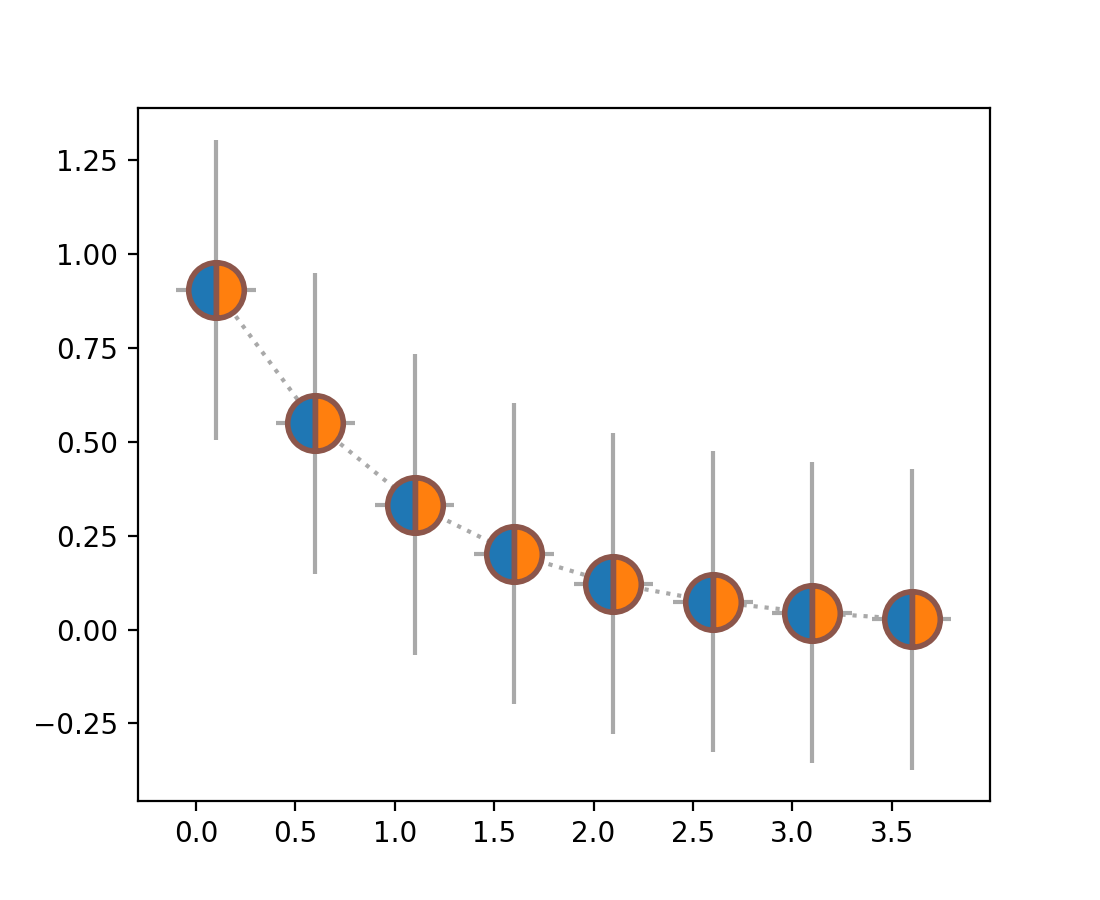
errorbar 支持 markerfacecoloralt#
现在,markerfacecoloralt 参数从 Axes.errorbar 传递到线绘图器。文档现在准确列出了哪些属性被传递给 Line2D,而不是声称所有关键字参数都被传递。
x = np.arange(0.1, 4, 0.5)
y = np.exp(-x)

fig, ax = plt.subplots()
ax.errorbar(x, y, xerr=0.2, yerr=0.4,
            linestyle=':', color='darkgrey',
            marker='o', markersize=20, fillstyle='left',
            markerfacecolor='tab:blue', markerfacecoloralt='tab:orange',
            markeredgecolor='tab:brown', markeredgewidth=2)
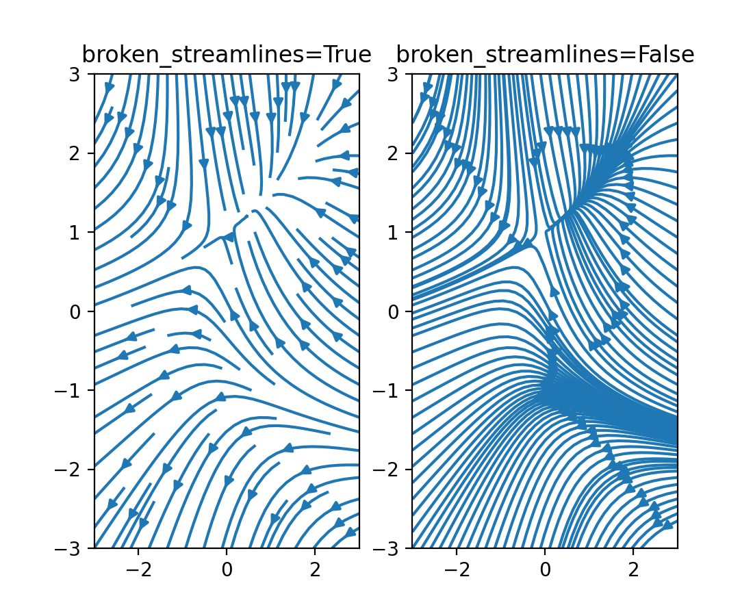
streamplot 可以禁用流线中断#
现在可以指定流线图具有连续、不间断的流线。以前流线会终止以限制单个网格单元中的线条数量。请参阅下面的图表之间的差异
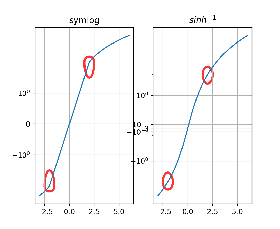
新轴刻度 asinh(实验性)#
新的 asinh 轴刻度提供了 symlog 的替代方案,它在刻度的准线性和渐近对数区域之间平滑过渡。这基于 arcsinh 变换,允许绘制跨越多个数量级的正负值。
stairs(..., fill=True) 通过设置线宽隐藏补丁边缘#
stairs(..., fill=True) 以前通过设置 edgecolor="none" 来隐藏补丁边缘。因此,稍后在补丁上调用 set_color() 会使补丁看起来更大。
现在,通过使用 linewidth=0,可以防止这种明显的尺寸变化。同样,调用 stairs(..., fill=True, linewidth=3) 将表现得更透明。
修复 Patch 类的虚线偏移#
以前,当使用虚线元组在 Patch 对象上设置线型时,偏移量会被忽略。现在,偏移量会按预期应用于 Patch,并且可以像用于 Line2D 对象一样使用。
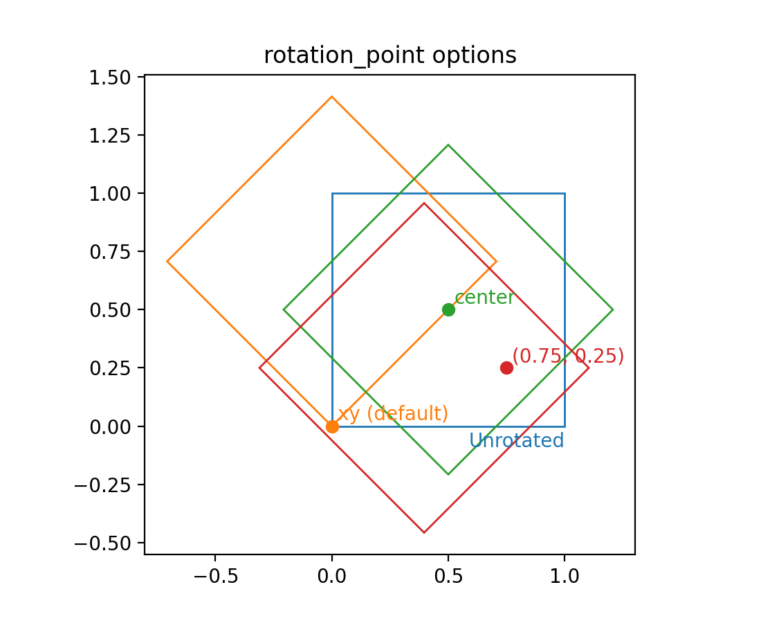
矩形补丁的旋转点#
现在可以使用 rotation_point 参数将 Rectangle 的旋转点设置为 'xy'、'center' 或一个由两个数字组成的元组。
颜色和颜色映射#
颜色序列注册表#
颜色序列注册表 ColorSequenceRegistry 包含 Matplotlib 通过名称识别的颜色序列(即简单列表)。通常不会直接使用它,而是通过 matplotlib.color_sequences 中的通用实例来使用。
创建不同查找表大小的颜色映射方法#
新方法 Colormap.resampled 创建一个具有指定查找表大小的新 Colormap 实例。这取代了通过 get_cmap 操作查找表大小的方式。
使用
get_cmap(name).resampled(N)
而不是
get_cmap(name, lut=N)
使用字符串设置规范#
现在可以使用相应刻度的字符串名称来设置规范(例如在图像上),例如 imshow(array, norm="log")。请注意,在这种情况下,也允许传递 vmin 和 vmax,因为底层会创建一个新的 Norm 实例。
标题、刻度和标签#
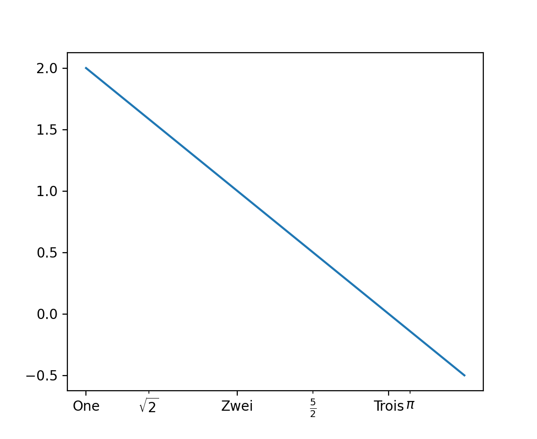
plt.xticks 和 plt.yticks 支持 minor 关键字参数#
现在可以通过设置 minor=True 来使用 pyplot.xticks 和 pyplot.yticks 设置或获取次要刻度。
plt.figure()
plt.plot([1, 2, 3, 3.5], [2, 1, 0, -0.5])
plt.xticks([1, 2, 3], ["One", "Zwei", "Trois"])
plt.xticks([np.sqrt(2), 2.5, np.pi],
           [r"$\sqrt{2}$", r"$\frac{5}{2}$", r"$\pi$"], minor=True)
图例#
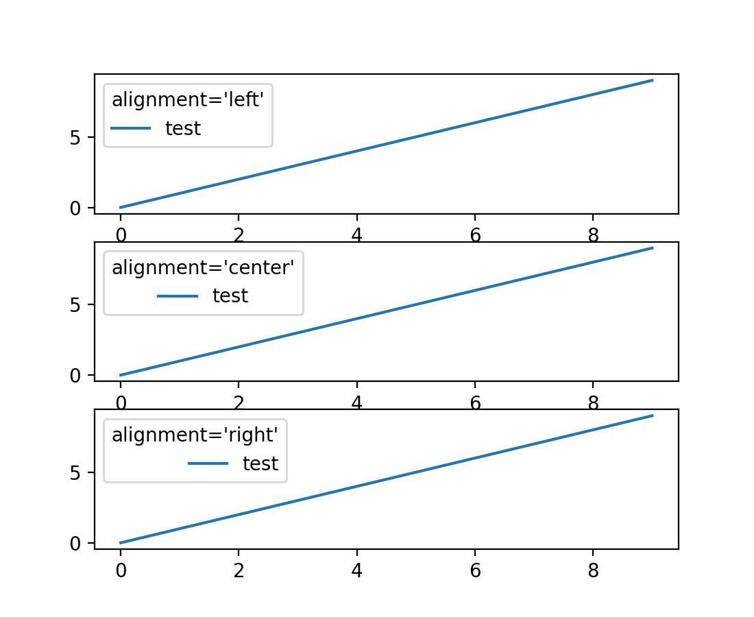
图例可以控制标题和句柄的对齐方式#
Legend 现在支持通过关键字参数 alignment 控制标题和句柄的对齐方式。您还可以使用 Legend.set_alignment 来控制现有图例的对齐方式。
fig, axs = plt.subplots(3, 1)
for i, alignment in enumerate(['left', 'center', 'right']):
    axs[i].plot(range(10), label='test')
    axs[i].legend(title=f'{alignment=}', alignment=alignment)
legend 的 ncol 关键字参数重命名为 ncols#
legend 中用于控制列数的 ncol 关键字参数已重命名为 ncols,以与 subplots 和 GridSpec 的 ncols 和 nrows 关键字保持一致。ncol 仍受支持以实现向后兼容,但不推荐使用。
标记#
marker 现在可以设置为字符串 "none"#
字符串 "none" 表示无标记,与其他支持小写版本的 API 一致。建议使用 "none" 而非 "None",以避免与 None 对象混淆。
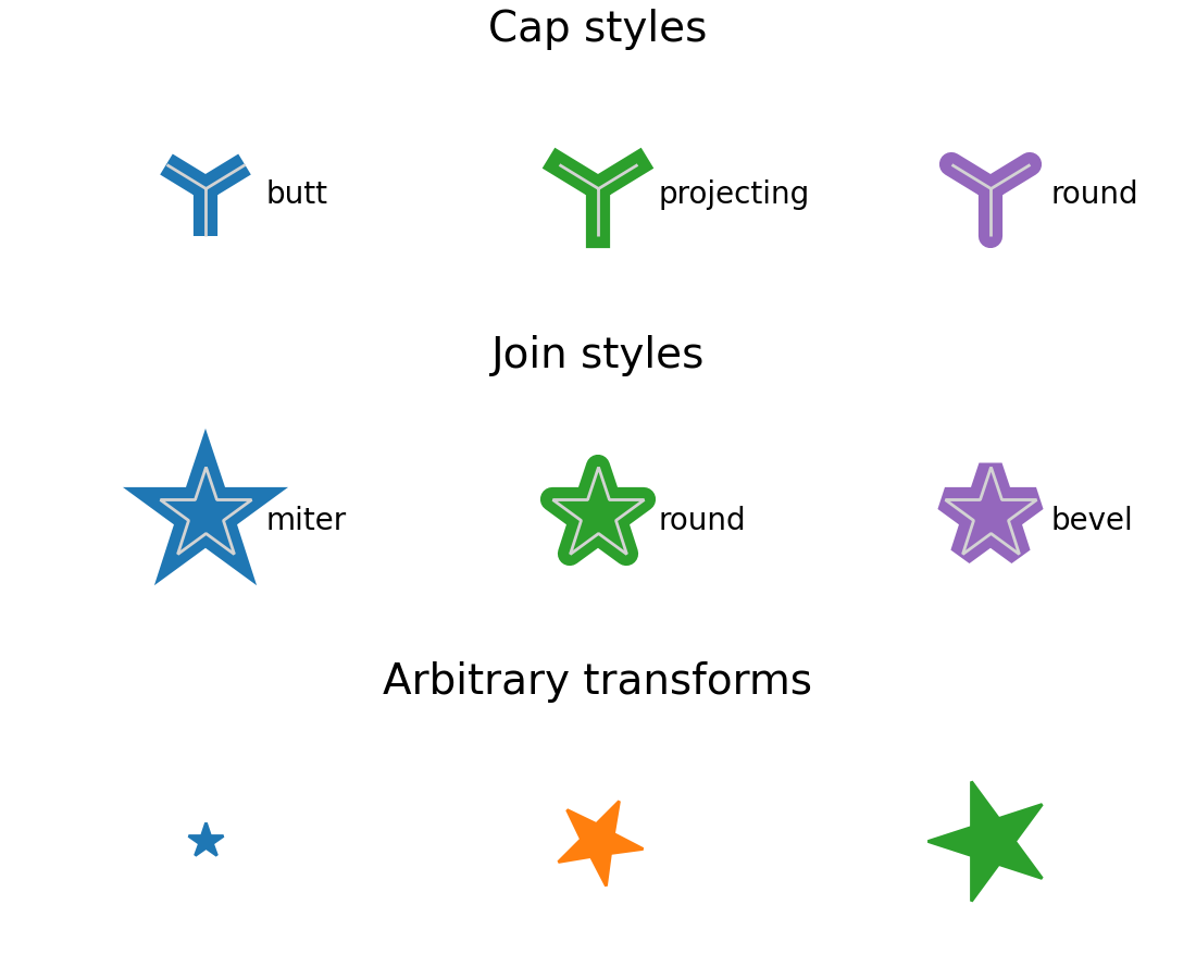
MarkerStyle 连接和帽样式的自定义#
新的 MarkerStyle 参数允许控制连接样式和帽样式,并允许用户提供应用于标记的变换(例如旋转)。
from matplotlib.markers import CapStyle, JoinStyle, MarkerStyle
from matplotlib.transforms import Affine2D

fig, axs = plt.subplots(3, 1, layout='constrained')
for ax in axs:
    ax.axis('off')
    ax.set_xlim(-0.5, 2.5)

axs[0].set_title('Cap styles', fontsize=14)
for col, cap in enumerate(CapStyle):
    axs[0].plot(col, 0, markersize=32, markeredgewidth=8,
                marker=MarkerStyle('1', capstyle=cap))
    # Show the marker edge for comparison with the cap.
    axs[0].plot(col, 0, markersize=32, markeredgewidth=1,
                markerfacecolor='none', markeredgecolor='lightgrey',
                marker=MarkerStyle('1'))
    axs[0].annotate(cap.name, (col, 0),
                    xytext=(20, -5), textcoords='offset points')

axs[1].set_title('Join styles', fontsize=14)
for col, join in enumerate(JoinStyle):
    axs[1].plot(col, 0, markersize=32, markeredgewidth=8,
                marker=MarkerStyle('*', joinstyle=join))
    # Show the marker edge for comparison with the join.
    axs[1].plot(col, 0, markersize=32, markeredgewidth=1,
                markerfacecolor='none', markeredgecolor='lightgrey',
                marker=MarkerStyle('*'))
    axs[1].annotate(join.name, (col, 0),
                    xytext=(20, -5), textcoords='offset points')

axs[2].set_title('Arbitrary transforms', fontsize=14)
for col, (size, rot) in enumerate(zip([2, 5, 7], [0, 45, 90])):
    t = Affine2D().rotate_deg(rot).scale(size)
    axs[2].plot(col, 0, marker=MarkerStyle('*', transform=t))
字体和文本#
字体回退#
现在可以指定字体系列列表,Matplotlib 将按顺序尝试它们以查找所需的字形。
plt.rcParams["font.size"] = 20
fig = plt.figure(figsize=(4.75, 1.85))

text = "There are 几个汉字 in between!"
fig.text(0.05, 0.65, text, family=["Noto Sans CJK JP", "Noto Sans TC"])
fig.text(0.05, 0.45, text, family=["DejaVu Sans", "Noto Sans CJK JP", "Noto Sans TC"])
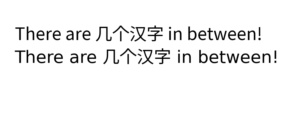
演示混合英文和中文文本的字体回退。
这目前适用于 Agg(以及所有 GUI 嵌入)、svg、pdf、ps 和 inline 后端。
可用字体名称列表#
可用字体列表现在易于访问。要获取 Matplotlib 中可用字体名称的列表,请使用
from matplotlib import font_manager
font_manager.get_font_names()
math_to_image 现在有一个 color 关键字参数#
为了方便支持依赖 Matplotlib 的 MathText 渲染来生成方程式图像的外部库,math_to_image 中添加了 color 关键字参数。
from matplotlib import mathtext
mathtext.math_to_image('$x^2$', 'filename.png', color='Maroon')
活动 URL 区域随链接文本旋转#
当图表中的链接文本旋转时,活动 URL 区域现在将包含旋转后的链接区域。以前,活动区域保持在原始的、未旋转的位置。
rcParams 改进#
允许全局设置图表标签大小和粗细,并与标题分开#
对于图表标签,Figure.supxlabel 和 Figure.supylabel,可以使用 rcParams["figure.labelsize"](默认:'large')和 rcParams["figure.labelweight"](默认:'normal')独立于图表标题设置其大小和粗细。
# Original (previously combined with below) rcParams:
plt.rcParams['figure.titlesize'] = 64
plt.rcParams['figure.titleweight'] = 'bold'

# New rcParams:
plt.rcParams['figure.labelsize'] = 32
plt.rcParams['figure.labelweight'] = 'bold'

fig, axs = plt.subplots(2, 2, layout='constrained')
for ax in axs.flat:
    ax.set(xlabel='xlabel', ylabel='ylabel')

fig.suptitle('suptitle')
fig.supxlabel('supxlabel')
fig.supylabel('supylabel')
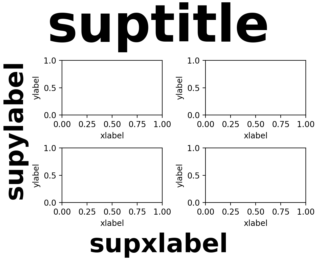
请注意,如果您已更改 rcParams["figure.titlesize"](默认值:'large')或 rcParams["figure.titleweight"](默认值:'normal'),则现在还必须更改引入的参数,以使结果与过去的表现一致。
Mathtext 解析可以全局禁用#
rcParams["text.parse_math"](默认值:True)设置可用于禁用所有 Text 对象中的 MathText 解析(最显著的是来自 Axes.text 方法)。
matplotlibrc 中的双引号字符串#
您现在可以在字符串周围使用双引号。这允许在字符串中使用 '#' 字符。如果没有引号,'#' 将被解释为注释的开始。特别是,您现在可以定义十六进制颜色
grid.color: "#b0b0b0"
3D 坐标系改进#
主平面视角标准化视图#
在主视图平面(即垂直于 XY、XZ 或 YZ 平面)中查看 3D 图表时,坐标轴将显示在标准位置。有关 3D 视图的更多信息,请参阅 mplot3d 视图角度 和 主要 3D 视图平面。
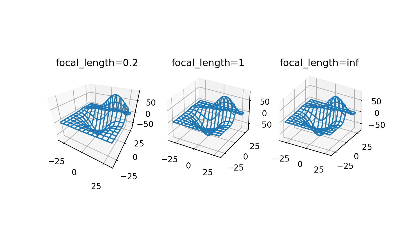
3D 摄像机自定义焦距#
3D 坐标系现在可以通过指定虚拟摄像机的焦距来更好地模拟真实世界摄像机。默认焦距为 1 对应 90° 视野(FOV),并与现有 3D 图表向后兼容。焦距在 1 到无穷大之间增加会“展平”图像,而焦距在 1 到 0 之间减小则会夸大透视效果,使图像更具明显的深度。
焦距可以通过以下公式从所需的 FOV 计算得出

from mpl_toolkits.mplot3d import axes3d

X, Y, Z = axes3d.get_test_data(0.05)

fig, axs = plt.subplots(1, 3, figsize=(7, 4),
                        subplot_kw={'projection': '3d'})

for ax, focal_length in zip(axs, [0.2, 1, np.inf]):
    ax.plot_wireframe(X, Y, Z, rstride=10, cstride=10)
    ax.set_proj_type('persp', focal_length=focal_length)
    ax.set_title(f"{focal_length=}")
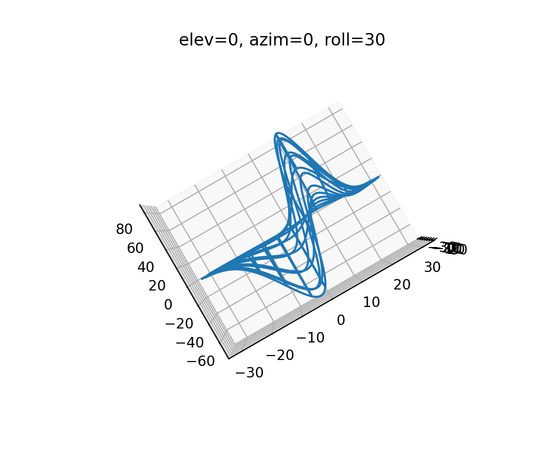
3D 图表增加了第三个“翻滚”视角#
3D 图表现在可以通过添加第三个翻滚角度从任何方向查看,该角度围绕视图轴旋转图表。使用鼠标的交互式旋转仍然只控制仰角和方位角,这意味着此功能与通过编程创建更复杂摄像机角度的用户相关。默认的翻滚角度 0 与现有 3D 图表向后兼容。
from mpl_toolkits.mplot3d import axes3d

X, Y, Z = axes3d.get_test_data(0.05)

fig, ax = plt.subplots(subplot_kw={'projection': '3d'})

ax.plot_wireframe(X, Y, Z, rstride=10, cstride=10)
ax.view_init(elev=0, azim=0, roll=30)
ax.set_title('elev=0, azim=0, roll=30')
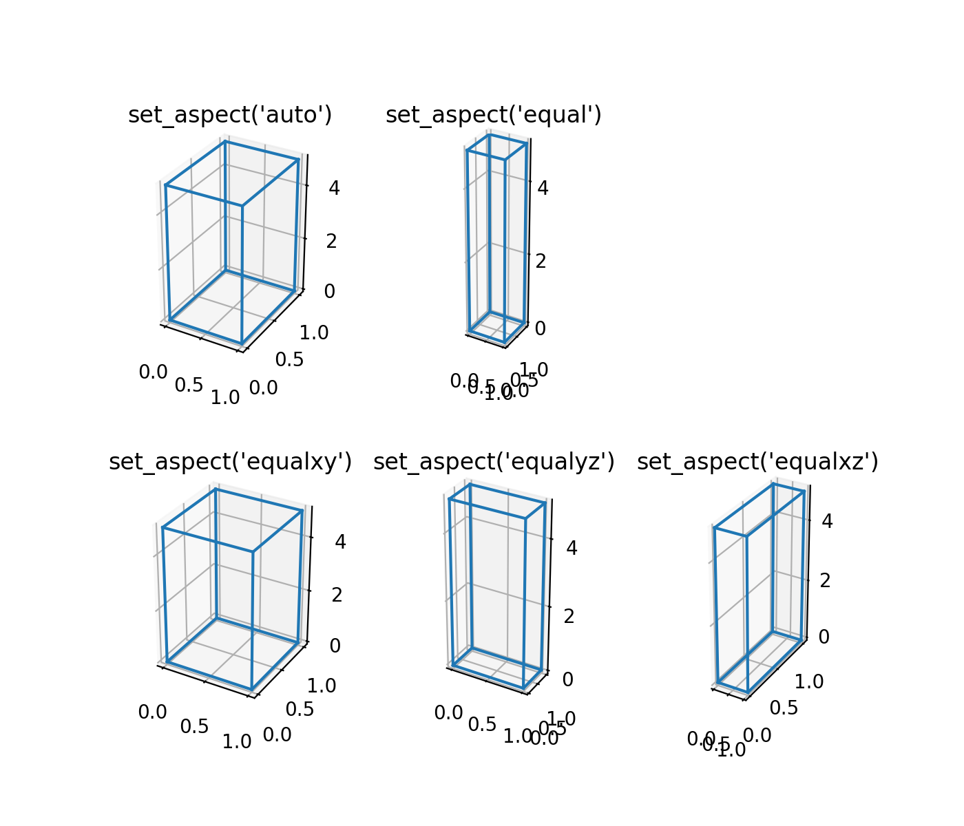
3D 图表的等宽高比#
用户可以将 3D 图表 X、Y、Z 轴的宽高比设置为 'equal'、'equalxy'、'equalxz' 或 'equalyz',而不是默认的 'auto'。
from itertools import combinations, product

aspects = [
    ['auto', 'equal', '.'],
    ['equalxy', 'equalyz', 'equalxz'],
]
fig, axs = plt.subplot_mosaic(aspects, figsize=(7, 6),
                              subplot_kw={'projection': '3d'})

# Draw rectangular cuboid with side lengths [1, 1, 5]
r = [0, 1]
scale = np.array([1, 1, 5])
pts = combinations(np.array(list(product(r, r, r))), 2)
for start, end in pts:
    if np.sum(np.abs(start - end)) == r[1] - r[0]:
        for ax in axs.values():
            ax.plot3D(*zip(start*scale, end*scale), color='C0')

# Set the aspect ratios
for aspect, ax in axs.items():
    ax.set_box_aspect((3, 4, 5))
    ax.set_aspect(aspect)
    ax.set_title(f'set_aspect({aspect!r})')
交互式工具改进#
旋转、宽高比校正和添加/移除状态#
RectangleSelector 和 EllipseSelector 现在可以在 -45° 到 45° 之间进行交互式旋转。范围限制目前由实现决定。旋转可以通过按下 r 键('r' 是 state_modifier_keys 中映射到 'rotate' 的默认键)或调用 selector.add_state('rotate') 来启用或禁用。
在使用“square”状态时,现在可以考虑坐标系的宽高比。这通过在选择器初始化时指定 use_data_coordinates='True' 来启用。
除了使用 state_modifier_keys 中定义的修饰键交互式更改选择器状态外,现在还可以使用 add_state 和 remove_state 方法通过编程方式更改选择器状态。
from matplotlib.widgets import RectangleSelector

values = np.arange(0, 100)

fig = plt.figure()
ax = fig.add_subplot()
ax.plot(values, values)

selector = RectangleSelector(ax, print, interactive=True,
                             drag_from_anywhere=True,
                             use_data_coordinates=True)
selector.add_state('rotate')  # alternatively press 'r' key
# rotate the selector interactively

selector.remove_state('rotate')  # alternatively press 'r' key

selector.add_state('square')
MultiCursor 现在支持跨多个图表分割的坐标系#
以前,MultiCursor 仅在所有目标坐标系属于同一图表时才起作用。
由于此更改,MultiCursor 构造函数的第一个参数已不再使用(它以前是所有坐标系的联合画布,但现在画布直接从坐标系列表中推断出来)。
PolygonSelector 边界框#
PolygonSelector 现在有一个 draw_bounding_box 参数,当设置为 True 时,将在多边形完成后绘制一个边界框。该边界框可以调整大小和移动,从而允许轻松调整多边形的点的大小。
设置 PolygonSelector 顶点#
现在可以通过使用 PolygonSelector.verts 属性以编程方式设置 PolygonSelector 的顶点。以这种方式设置顶点将重置选择器,并使用提供的顶点创建一个新的完整选择器。
SpanSelector 小部件现在可以吸附到指定值#
SpanSelector 小部件现在可以吸附到由 snap_values 参数指定的值。
更多工具栏图标针对深色主题进行了样式化#
在 macOS 和 Tk 后端上,使用深色主题时,工具栏图标现在将反色。
平台特定更改#
Wx 后端使用标准工具栏#
工具栏在 Wx 窗口上设置为标准工具栏,而不是自定义尺寸器。
macosx 后端改进#
修饰键处理更一致#
macosx 后端现在以与其他后端更一致的方式处理修饰键。有关更多信息,请参阅 事件连接 中的表格。
savefig.directory rcParam 支持#
macosx 后端现在将遵循 rcParams["savefig.directory"](默认值:'~')设置。如果设置为非空字符串,则保存对话框将默认为此目录,并保留后续保存目录的更改。
figure.raise_window rcParam 支持#
macosx 后端现在将遵循 rcParams["figure.raise_window"](默认值:True)设置。如果设置为 False,图表窗口在更新时将不会被置顶。
全屏切换支持#
与其他后端一样,macosx 后端现在支持切换全屏视图。默认情况下,可以通过按 f 键切换此视图。
改进的动画和 blitting 支持#
macosx 后端已得到改进,修复了 blitting、带有新 artists 的动画帧,并减少了不必要的绘制调用。
Qt 后端应用 macOS 应用程序图标#
在 macOS 上使用基于 Qt 的后端时,现在将设置应用程序图标,与其他后端/平台上的做法一致。
新的最低 macOS 版本要求#
macosx 后端现在需要 macOS >= 10.12。
对 ARM 上的 Windows 的支持#
已添加对 arm64 目标上的 Windows 的初步支持。此支持需要 FreeType 2.11 或更高版本。
目前尚无二进制 wheel 可用,但可以从源代码构建。