注意
转到末尾下载完整示例代码。
色图归一化#
默认使用色图的对象会将其中的颜色从数据值 vmin 到 vmax 进行线性映射。例如:
会将 Z 中的数据从 -1 到 +1 线性映射,因此 Z=0 将对应色图 RdBu_r 的中心颜色(在此例中为白色)。
Matplotlib 分两步进行此映射:首先将输入数据归一化到 [0, 1] 范围,然后映射到色图中的索引。归一化是 matplotlib.colors() 模块中定义的类。默认的线性归一化是 matplotlib.colors.Normalize()。
将数据映射到颜色的Artist通过传递参数 vmin 和 vmax 来构建 matplotlib.colors.Normalize() 实例,然后调用它:
>>> import matplotlib as mpl
>>> norm = mpl.colors.Normalize(vmin=-1, vmax=1)
>>> norm(0)
0.5
然而,有时将数据以非线性方式映射到色图会很有用。
对数归一化#
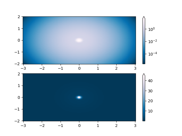
最常见的转换之一是通过取数据的对数(以10为底)来绘图。此转换对于显示跨不同尺度范围的变化非常有用。使用 colors.LogNorm 通过 \(log_{10}\) 对数据进行归一化。在下面的示例中,有两个峰,一个比另一个小得多。使用 colors.LogNorm,可以清晰地看到每个峰的形状和位置:
import matplotlib.pyplot as plt
import numpy as np

from matplotlib import cm
import matplotlib.cbook as cbook
import matplotlib.colors as colors

N = 100
X, Y = np.mgrid[-3:3:complex(0, N), -2:2:complex(0, N)]

# A low hump with a spike coming out of the top right.  Needs to have
# z/colour axis on a log scale, so we see both hump and spike. A linear
# scale only shows the spike.
Z1 = np.exp(-X**2 - Y**2)
Z2 = np.exp(-(X * 10)**2 - (Y * 10)**2)
Z = Z1 + 50 * Z2

fig, ax = plt.subplots(2, 1)

pcm = ax[0].pcolor(X, Y, Z,
                   norm=colors.LogNorm(vmin=Z.min(), vmax=Z.max()),
                   cmap='PuBu_r', shading='auto')
fig.colorbar(pcm, ax=ax[0], extend='max')

pcm = ax[1].pcolor(X, Y, Z, cmap='PuBu_r', shading='auto')
fig.colorbar(pcm, ax=ax[1], extend='max')
plt.show()
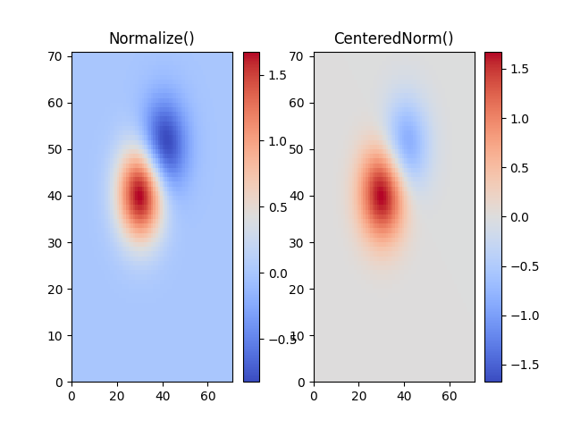
中心归一化#
在许多情况下,数据以中心对称,例如,围绕中心0的正负异常值。在这种情况下,我们希望中心映射到0.5,并且最大偏离中心的数据点映射到1.0(如果其值大于中心)或0.0(否则)。归一化器 colors.CenteredNorm 会自动创建这样的映射。它非常适合与发散色图结合使用,该色图使用不同颜色的边缘,并在中心以不饱和颜色相遇。
如果对称中心与 0 不同,可以通过 vcenter 参数设置。对于中心两侧的对数缩放,请参阅下面的 colors.SymLogNorm;要在中心上方和下方应用不同的映射,请使用下面的 colors.TwoSlopeNorm。
delta = 0.1
x = np.arange(-3.0, 4.001, delta)
y = np.arange(-4.0, 3.001, delta)
X, Y = np.meshgrid(x, y)
Z1 = np.exp(-X**2 - Y**2)
Z2 = np.exp(-(X - 1)**2 - (Y - 1)**2)
Z = (0.9*Z1 - 0.5*Z2) * 2

# select a divergent colormap
cmap = cm.coolwarm

fig, (ax1, ax2) = plt.subplots(ncols=2)
pc = ax1.pcolormesh(Z, cmap=cmap)
fig.colorbar(pc, ax=ax1)
ax1.set_title('Normalize()')

pc = ax2.pcolormesh(Z, norm=colors.CenteredNorm(), cmap=cmap)
fig.colorbar(pc, ax=ax2)
ax2.set_title('CenteredNorm()')

plt.show()
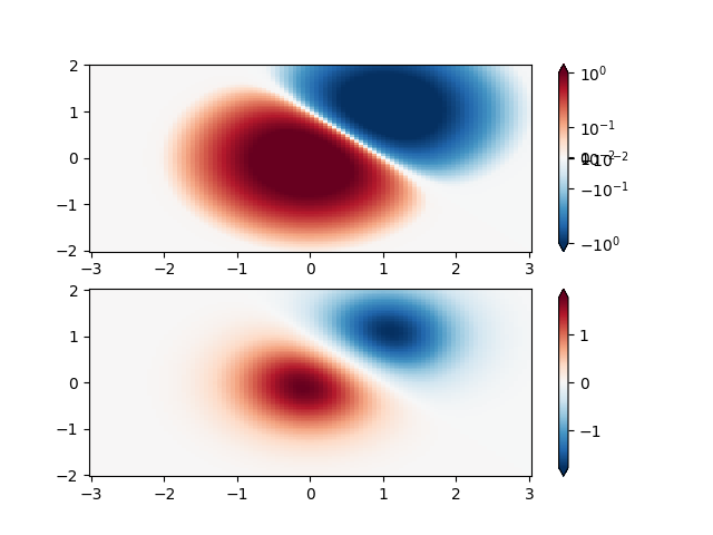
对称对数归一化#
同样,有时会出现数据既有正值也有负值的情况,但我们仍然希望对两者都应用对数缩放。在这种情况下,负数也按对数缩放,并映射到较小的数字;例如,如果 vmin=-vmax,则负数从 0 映射到 0.5,正数从 0.5 映射到 1。
由于接近零的值的对数趋于无穷大,因此需要将围绕零的一个小范围线性映射。参数 linthresh 允许用户指定此范围的大小(-linthresh,linthresh)。此范围在色图中的大小由 linscale 设置。当 linscale == 1.0(默认值)时,用于线性范围的正负两半的空间将等于对数范围中的一个十年。
N = 100
X, Y = np.mgrid[-3:3:complex(0, N), -2:2:complex(0, N)]
Z1 = np.exp(-X**2 - Y**2)
Z2 = np.exp(-(X - 1)**2 - (Y - 1)**2)
Z = (Z1 - Z2) * 2

fig, ax = plt.subplots(2, 1)

pcm = ax[0].pcolormesh(X, Y, Z,
                       norm=colors.SymLogNorm(linthresh=0.03, linscale=0.03,
                                              vmin=-1.0, vmax=1.0, base=10),
                       cmap='RdBu_r', shading='auto')
fig.colorbar(pcm, ax=ax[0], extend='both')

pcm = ax[1].pcolormesh(X, Y, Z, cmap='RdBu_r', vmin=-np.max(Z), shading='auto')
fig.colorbar(pcm, ax=ax[1], extend='both')
plt.show()
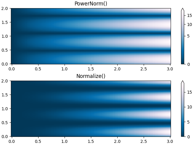
幂律归一化#
有时将颜色重新映射到幂律关系(即 \(y=x^{\gamma}\),其中 \(\gamma\) 是幂)会很有用。为此,我们使用 colors.PowerNorm。它接受一个参数 gamma(gamma == 1.0 将只产生默认的线性归一化):
注意
使用这种类型的转换来绘制数据应该有充分的理由。技术观众习惯于线性和对数轴以及数据转换。幂律较不常见,应明确告知观众已使用它们。
N = 100
X, Y = np.mgrid[0:3:complex(0, N), 0:2:complex(0, N)]
Z1 = (1 + np.sin(Y * 10.)) * X**2

fig, ax = plt.subplots(2, 1, layout='constrained')

pcm = ax[0].pcolormesh(X, Y, Z1, norm=colors.PowerNorm(gamma=0.5),
                       cmap='PuBu_r', shading='auto')
fig.colorbar(pcm, ax=ax[0], extend='max')
ax[0].set_title('PowerNorm()')

pcm = ax[1].pcolormesh(X, Y, Z1, cmap='PuBu_r', shading='auto')
fig.colorbar(pcm, ax=ax[1], extend='max')
ax[1].set_title('Normalize()')
plt.show()
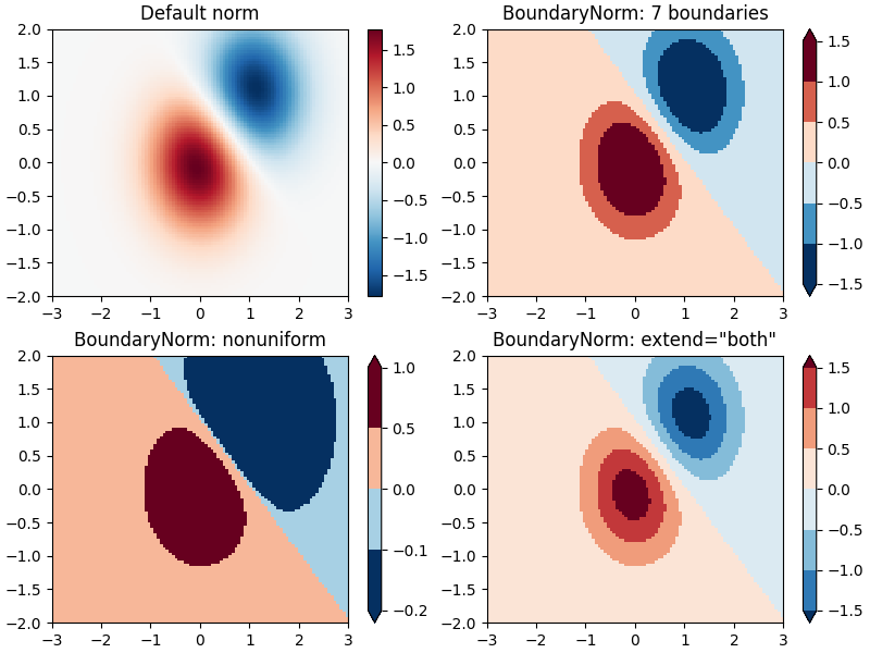
离散边界归一化#
Matplotlib 附带的另一个归一化是 colors.BoundaryNorm。除了 vmin 和 vmax 之外,它还接受数据要映射到的边界作为参数。然后颜色在这些“边界”之间线性分布。它还可以接受一个 extend 参数,以将超出范围的上下值添加到颜色分布的范围中。例如:
注意:与其他归一化不同,此归一化返回 0 到 ncolors-1 的值。
N = 100
X, Y = np.meshgrid(np.linspace(-3, 3, N), np.linspace(-2, 2, N))
Z1 = np.exp(-X**2 - Y**2)
Z2 = np.exp(-(X - 1)**2 - (Y - 1)**2)
Z = ((Z1 - Z2) * 2)[:-1, :-1]

fig, ax = plt.subplots(2, 2, figsize=(8, 6), layout='constrained')
ax = ax.flatten()

# Default norm:
pcm = ax[0].pcolormesh(X, Y, Z, cmap='RdBu_r')
fig.colorbar(pcm, ax=ax[0], orientation='vertical')
ax[0].set_title('Default norm')

# Even bounds give a contour-like effect:
bounds = np.linspace(-1.5, 1.5, 7)
norm = colors.BoundaryNorm(boundaries=bounds, ncolors=256)
pcm = ax[1].pcolormesh(X, Y, Z, norm=norm, cmap='RdBu_r')
fig.colorbar(pcm, ax=ax[1], extend='both', orientation='vertical')
ax[1].set_title('BoundaryNorm: 7 boundaries')

# Bounds may be unevenly spaced:
bounds = np.array([-0.2, -0.1, 0, 0.5, 1])
norm = colors.BoundaryNorm(boundaries=bounds, ncolors=256)
pcm = ax[2].pcolormesh(X, Y, Z, norm=norm, cmap='RdBu_r')
fig.colorbar(pcm, ax=ax[2], extend='both', orientation='vertical')
ax[2].set_title('BoundaryNorm: nonuniform')

# With out-of-bounds colors:
bounds = np.linspace(-1.5, 1.5, 7)
norm = colors.BoundaryNorm(boundaries=bounds, ncolors=256, extend='both')
pcm = ax[3].pcolormesh(X, Y, Z, norm=norm, cmap='RdBu_r')
# The colorbar inherits the "extend" argument from BoundaryNorm.
fig.colorbar(pcm, ax=ax[3], orientation='vertical')
ax[3].set_title('BoundaryNorm: extend="both"')
plt.show()
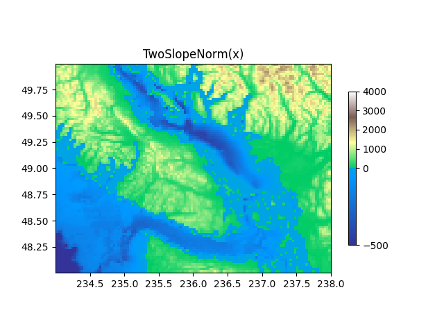
TwoSlopeNorm:中心两侧的不同映射#
有时我们希望在概念中心点的两侧使用不同的色图,并且我们希望这两个色图具有不同的线性比例。一个例子是地形图,其中陆地和海洋的中心在零,但陆地通常比水域具有更大的海拔范围,并且它们通常由不同的色图表示。
dem = cbook.get_sample_data('topobathy.npz')
topo = dem['topo']
longitude = dem['longitude']
latitude = dem['latitude']

fig, ax = plt.subplots()
# make a colormap that has land and ocean clearly delineated and of the
# same length (256 + 256)
colors_undersea = plt.cm.terrain(np.linspace(0, 0.17, 256))
colors_land = plt.cm.terrain(np.linspace(0.25, 1, 256))
all_colors = np.vstack((colors_undersea, colors_land))
terrain_map = colors.LinearSegmentedColormap.from_list(
    'terrain_map', all_colors)

# make the norm:  Note the center is offset so that the land has more
# dynamic range:
divnorm = colors.TwoSlopeNorm(vmin=-500., vcenter=0, vmax=4000)

pcm = ax.pcolormesh(longitude, latitude, topo, rasterized=True, norm=divnorm,
                    cmap=terrain_map, shading='auto')
# Simple geographic plot, set aspect ratio because distance between lines of
# longitude depends on latitude.
ax.set_aspect(1 / np.cos(np.deg2rad(49)))
ax.set_title('TwoSlopeNorm(x)')
cb = fig.colorbar(pcm, shrink=0.6)
cb.set_ticks([-500, 0, 1000, 2000, 3000, 4000])
plt.show()
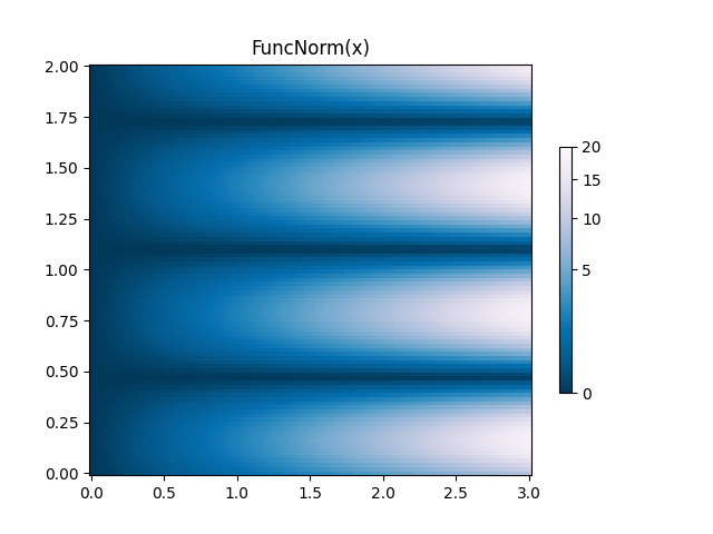
FuncNorm:任意函数归一化#
如果上述归一化无法满足您的需求,您可以使用 FuncNorm 定义自己的归一化。请注意,此示例与幂为 0.5 的 PowerNorm 相同:
def _forward(x):
    return np.sqrt(x)


def _inverse(x):
    return x**2

N = 100
X, Y = np.mgrid[0:3:complex(0, N), 0:2:complex(0, N)]
Z1 = (1 + np.sin(Y * 10.)) * X**2
fig, ax = plt.subplots()

norm = colors.FuncNorm((_forward, _inverse), vmin=0, vmax=20)
pcm = ax.pcolormesh(X, Y, Z1, norm=norm, cmap='PuBu_r', shading='auto')
ax.set_title('FuncNorm(x)')
fig.colorbar(pcm, shrink=0.6)
plt.show()
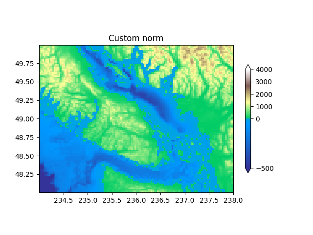
自定义归一化:手动实现两个线性范围#
上面描述的 TwoSlopeNorm 是定义您自己的归一化的一个有用示例。请注意,要使颜色条正常工作,您必须为您的归一化定义一个反函数:
class MidpointNormalize(colors.Normalize):
    def __init__(self, vmin=None, vmax=None, vcenter=None, clip=False):
        self.vcenter = vcenter
        super().__init__(vmin, vmax, clip)

    def __call__(self, value, clip=None):
        # I'm ignoring masked values and all kinds of edge cases to make a
        # simple example...
        # Note also that we must extrapolate beyond vmin/vmax
        x, y = [self.vmin, self.vcenter, self.vmax], [0, 0.5, 1.]
        return np.ma.masked_array(np.interp(value, x, y,
                                            left=-np.inf, right=np.inf))

    def inverse(self, value):
        y, x = [self.vmin, self.vcenter, self.vmax], [0, 0.5, 1]
        return np.interp(value, x, y, left=-np.inf, right=np.inf)


fig, ax = plt.subplots()
midnorm = MidpointNormalize(vmin=-500., vcenter=0, vmax=4000)

pcm = ax.pcolormesh(longitude, latitude, topo, rasterized=True, norm=midnorm,
                    cmap=terrain_map, shading='auto')
ax.set_aspect(1 / np.cos(np.deg2rad(49)))
ax.set_title('Custom norm')
cb = fig.colorbar(pcm, shrink=0.6, extend='both')
cb.set_ticks([-500, 0, 1000, 2000, 3000, 4000])

plt.show()
脚本总运行时间: (0 分 5.784 秒)