注意
跳转到末尾以下载完整示例代码。
Matplotlib 中的文本#
Matplotlib 提供了广泛的文本支持,包括对数学表达式的支持、对栅格和矢量输出的 TrueType 支持、带有任意旋转的换行文本以及 Unicode 支持。
由于它直接将字体嵌入到输出文档中(例如,Postscript 或 PDF),因此您在屏幕上看到的就是打印件中获得的效果。FreeType 支持生成非常美观的抗锯齿字体,即使在较小的栅格尺寸下也表现良好。Matplotlib 包含其自己的 matplotlib.font_manager(感谢 Paul Barrett),它实现了一个跨平台、符合 W3C 标准的字体查找算法。
用户可以通过在 rc 文件中设置合理的默认值来极大地控制文本属性(字体大小、字体粗细、文本位置和颜色等)。更重要的是,对于对数学或科学图形感兴趣的用户,Matplotlib 实现了大量的 TeX 数学符号和命令,支持在图中的任何位置使用数学表达式。
基本文本命令#
以下命令用于在隐式和显式接口中创建文本(有关权衡的解释,请参见Matplotlib 应用程序接口 (API))
隐式 API |
显式 API |
描述 |
|---|---|---|
在 |
||
在 |
||
为 |
||
为 |
||
为 |
||
在 |
||
为 |
所有这些函数都会创建并返回一个 Text 实例,该实例可以通过各种字体和其他属性进行配置。下面的示例展示了所有这些命令的实际应用,更多详细信息将在后续章节中提供。
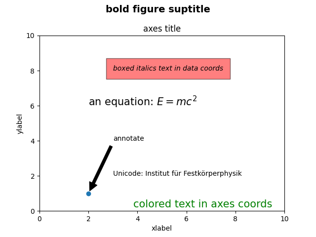
import matplotlib.pyplot as plt

import matplotlib

fig = plt.figure()
ax = fig.add_subplot()
fig.subplots_adjust(top=0.85)

# Set titles for the figure and the subplot respectively
fig.suptitle('bold figure suptitle', fontsize=14, fontweight='bold')
ax.set_title('axes title')

ax.set_xlabel('xlabel')
ax.set_ylabel('ylabel')

# Set both x- and y-axis limits to [0, 10] instead of default [0, 1]
ax.axis([0, 10, 0, 10])

ax.text(3, 8, 'boxed italics text in data coords', style='italic',
        bbox={'facecolor': 'red', 'alpha': 0.5, 'pad': 10})

ax.text(2, 6, r'an equation: $E=mc^2$', fontsize=15)

ax.text(3, 2, 'Unicode: Institut für Festkörperphysik')

ax.text(0.95, 0.01, 'colored text in axes coords',
        verticalalignment='bottom', horizontalalignment='right',
        transform=ax.transAxes,
        color='green', fontsize=15)

ax.plot([2], [1], 'o')
ax.annotate('annotate', xy=(2, 1), xytext=(3, 4),
            arrowprops=dict(facecolor='black', shrink=0.05))

plt.show()
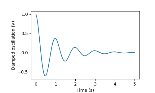
X 轴和 Y 轴标签#
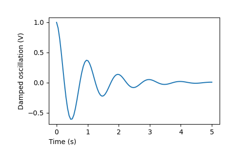
通过 set_xlabel 和 set_ylabel 方法来指定 X 轴和 Y 轴的标签非常简单。
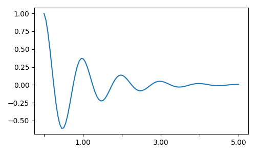
import matplotlib.pyplot as plt
import numpy as np

x1 = np.linspace(0.0, 5.0, 100)
y1 = np.cos(2 * np.pi * x1) * np.exp(-x1)

fig, ax = plt.subplots(figsize=(5, 3))
fig.subplots_adjust(bottom=0.15, left=0.2)
ax.plot(x1, y1)
ax.set_xlabel('Time (s)')
ax.set_ylabel('Damped oscillation (V)')

plt.show()
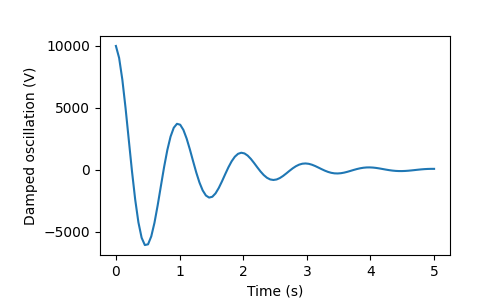
X 轴和 Y 轴标签会自动放置,以便它们与 X 轴和 Y 轴刻度标签不重叠。将下面的图与上面的图进行比较,请注意 Y 轴标签位于上面图的左侧。
fig, ax = plt.subplots(figsize=(5, 3))
fig.subplots_adjust(bottom=0.15, left=0.2)
ax.plot(x1, y1*10000)
ax.set_xlabel('Time (s)')
ax.set_ylabel('Damped oscillation (V)')

plt.show()
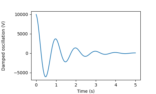
如果您想移动标签,可以指定 labelpad 关键字参数,其值以点为单位(1/72 英寸,与指定字体大小的单位相同)。
fig, ax = plt.subplots(figsize=(5, 3))
fig.subplots_adjust(bottom=0.15, left=0.2)
ax.plot(x1, y1*10000)
ax.set_xlabel('Time (s)')
ax.set_ylabel('Damped oscillation (V)', labelpad=18)

plt.show()
或者,标签接受所有 Text 关键字参数,包括 position,通过它我们可以手动指定标签位置。在这里,我们将 X 轴标签放置在坐标轴的最左侧。请注意,此位置的 Y 坐标无效 — 要调整 Y 位置,我们需要使用 labelpad 关键字参数。
fig, ax = plt.subplots(figsize=(5, 3))
fig.subplots_adjust(bottom=0.15, left=0.2)
ax.plot(x1, y1)
ax.set_xlabel('Time (s)', position=(0., 1e6), horizontalalignment='left')
ax.set_ylabel('Damped oscillation (V)')

plt.show()
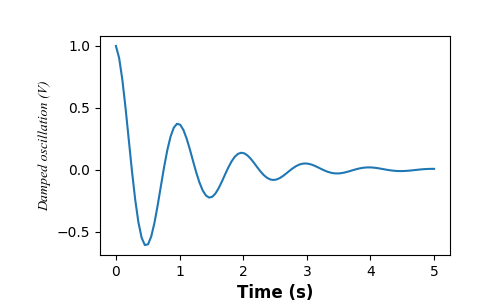
本教程中的所有标签都可以通过操作 matplotlib.font_manager.FontProperties 方法,或者通过向 set_xlabel 传递命名关键字参数来更改。
from matplotlib.font_manager import FontProperties

font = FontProperties(family='Times New Roman', style='italic')

fig, ax = plt.subplots(figsize=(5, 3))
fig.subplots_adjust(bottom=0.15, left=0.2)
ax.plot(x1, y1)
ax.set_xlabel('Time (s)', fontsize='large', fontweight='bold')
ax.set_ylabel('Damped oscillation (V)', fontproperties=font)

plt.show()
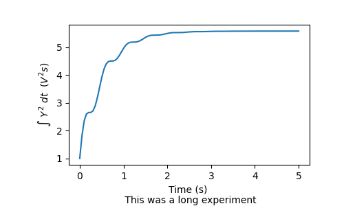
最后,我们可以在所有文本对象中使用原生 TeX 渲染并实现多行显示
fig, ax = plt.subplots(figsize=(5, 3))
fig.subplots_adjust(bottom=0.2, left=0.2)
ax.plot(x1, np.cumsum(y1**2))
ax.set_xlabel('Time (s) \n This was a long experiment')
ax.set_ylabel(r'$\int\ Y^2\ dt\ \ (V^2 s)$')
plt.show()
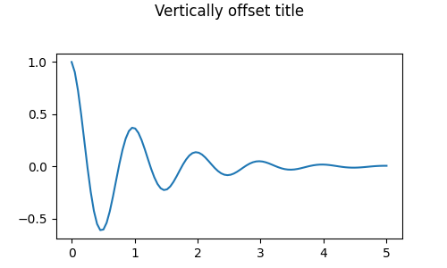
标题#
子图标题的设置方式与标签大致相同,但有一个 loc 关键字参数可以改变位置和对齐方式(默认值为 "center")。
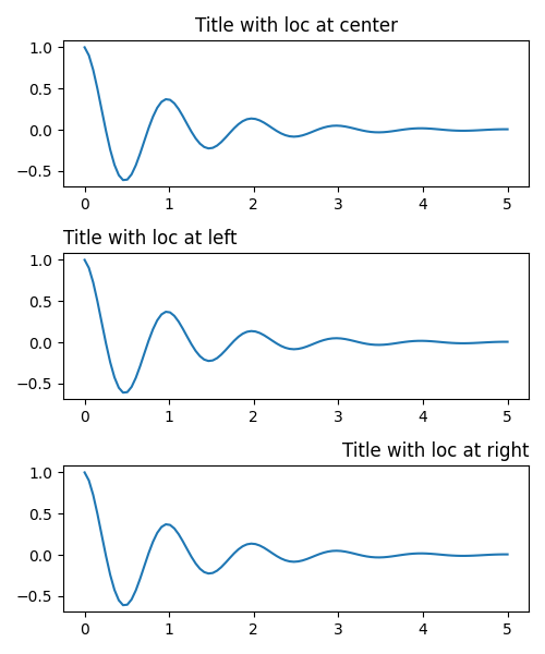
标题的垂直间距通过 rcParams["axes.titlepad"] 控制(默认值:6.0)。将其设置为不同值会移动标题。
fig, ax = plt.subplots(figsize=(5, 3))
fig.subplots_adjust(top=0.8)
ax.plot(x1, y1)
ax.set_title('Vertically offset title', pad=30)
plt.show()
刻度线和刻度标签#
放置刻度线和刻度标签是生成图形中一个非常棘手的方面。Matplotlib 会尽力自动完成此任务,但它也提供了一个非常灵活的框架,用于确定刻度位置的选择以及它们的标记方式。
术语#
坐标轴 具有一个 matplotlib.axis.Axis 对象,用于 ax.xaxis 和 ax.yaxis,其中包含有关轴中标签布局方式的信息。
轴的 API 在 axis 的文档中有详细解释。
一个 Axis 对象具有主刻度线和次刻度线。该 Axis 具有 Axis.set_major_locator 和 Axis.set_minor_locator 方法,这些方法使用正在绘制的数据来确定主刻度线和次刻度线的位置。还有 Axis.set_major_formatter 和 Axis.set_minor_formatter 方法用于格式化刻度标签。
简单刻度线#
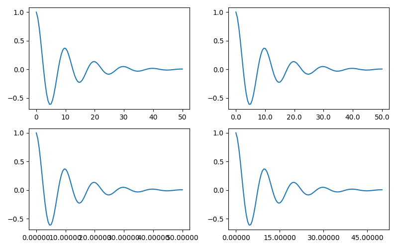
通常方便的做法是简单地定义刻度值,有时也定义刻度标签,从而覆盖默认的定位器 (locators) 和格式化器 (formatters)。然而,不建议这样做,因为它会破坏图的交互式导航。它还会重置轴限制:请注意,第二个图具有我们要求的刻度线,包括那些远超出自动视图限制的刻度线。
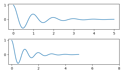
我们当然可以在事后修复这个问题,但这确实凸显了硬编码刻度线的弱点。此示例还更改了刻度线的格式
fig, axs = plt.subplots(2, 1, figsize=(5, 3), tight_layout=True)
axs[0].plot(x1, y1)
axs[1].plot(x1, y1)
ticks = np.arange(0., 8.1, 2.)
# list comprehension to get all tick labels...
tickla = [f'{tick:1.2f}' for tick in ticks]
axs[1].xaxis.set_ticks(ticks)
axs[1].xaxis.set_ticklabels(tickla)
axs[1].set_xlim(axs[0].get_xlim())
plt.show()
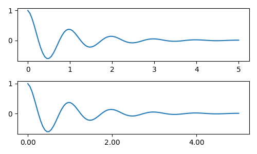
刻度定位器和格式化器#
我们可以不用列出所有刻度标签,而是使用 matplotlib.ticker.StrMethodFormatter(新式 str.format() 格式字符串)或 matplotlib.ticker.FormatStrFormatter(旧式 '%' 格式字符串)并将其传递给 ax.xaxis。也可以通过传递一个 str 来创建 matplotlib.ticker.StrMethodFormatter,而无需显式创建格式化器。
当然,我们也可以使用非默认的定位器来设置刻度位置。请注意,我们仍然传递刻度值,但上面使用的 X 轴限制修复是不必要的。

默认的格式化器是 matplotlib.ticker.MaxNLocator,调用方式为 ticker.MaxNLocator(self, nbins='auto', steps=[1, 2, 2.5, 5, 10])。steps 参数包含一个可用于刻度值的倍数列表。在这种情况下,2、4、6 是可接受的刻度,20、40、60 或 0.2、0.4、0.6 也是如此。然而,3、6、9 是不可接受的,因为 3 不在 steps 列表中。
设置 nbins=auto 会使用算法根据轴长确定可接受的刻度数量。会考虑刻度标签的字体大小,但不考虑刻度字符串的长度(因为它尚未可知)。在底部行中,刻度标签相当大,因此我们将 nbins=4 以使标签适合右侧图。
fig, axs = plt.subplots(2, 2, figsize=(8, 5), tight_layout=True)
for n, ax in enumerate(axs.flat):
    ax.plot(x1*10., y1)

formatter = matplotlib.ticker.FormatStrFormatter('%1.1f')
locator = matplotlib.ticker.MaxNLocator(nbins='auto', steps=[1, 4, 10])
axs[0, 1].xaxis.set_major_locator(locator)
axs[0, 1].xaxis.set_major_formatter(formatter)

formatter = matplotlib.ticker.FormatStrFormatter('%1.5f')
locator = matplotlib.ticker.AutoLocator()
axs[1, 0].xaxis.set_major_formatter(formatter)
axs[1, 0].xaxis.set_major_locator(locator)

formatter = matplotlib.ticker.FormatStrFormatter('%1.5f')
locator = matplotlib.ticker.MaxNLocator(nbins=4)
axs[1, 1].xaxis.set_major_formatter(formatter)
axs[1, 1].xaxis.set_major_locator(locator)

plt.show()
最后,我们可以使用 matplotlib.ticker.FuncFormatter 为格式化器指定函数。此外,与 matplotlib.ticker.StrMethodFormatter 类似,传递一个函数将自动创建一个 matplotlib.ticker.FuncFormatter。
def formatoddticks(x, pos):
    """Format odd tick positions."""
    if x % 2:
        return f'{x:1.2f}'
    else:
        return ''


fig, ax = plt.subplots(figsize=(5, 3), tight_layout=True)
ax.plot(x1, y1)
locator = matplotlib.ticker.MaxNLocator(nbins=6)
ax.xaxis.set_major_formatter(formatoddticks)
ax.xaxis.set_major_locator(locator)

plt.show()
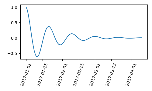
日期刻度线#
Matplotlib 可以接受 datetime.datetime 和 numpy.datetime64 对象作为绘图参数。日期和时间需要特殊格式化,这通常需要手动干预才能获得更好的效果。为了提供帮助,日期具有特殊的定位器和格式化器,定义在 matplotlib.dates 模块中。
以下简单示例说明了这一概念。请注意我们如何旋转刻度标签,使它们不重叠。
import datetime

fig, ax = plt.subplots(figsize=(5, 3), tight_layout=True)
base = datetime.datetime(2017, 1, 1, 0, 0, 1)
time = [base + datetime.timedelta(days=x) for x in range(len(x1))]

ax.plot(time, y1)
ax.tick_params(axis='x', rotation=70)
plt.show()
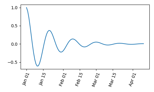
我们可以将格式传递给 matplotlib.dates.DateFormatter。如果两个刻度标签非常靠近,我们可以使用 dates.DayLocator 类,它允许我们指定要使用的月份中的天数列表。类似的格式化器列在 matplotlib.dates 模块中。
import matplotlib.dates as mdates

locator = mdates.DayLocator(bymonthday=[1, 15])
formatter = mdates.DateFormatter('%b %d')

fig, ax = plt.subplots(figsize=(5, 3), tight_layout=True)
ax.xaxis.set_major_locator(locator)
ax.xaxis.set_major_formatter(formatter)
ax.plot(time, y1)
ax.tick_params(axis='x', rotation=70)
plt.show()
图例和注释#
脚本总运行时间: (0 分钟 5.399 秒)